Color is a versatile design tool that can help you enhance the beauty of interior space. The colors you choose will consume the space and set its tone so it’s extremely important to make the right choice. This can be a daunting and time-consuming task if you aren’t sure what you’re doing.
The color selection for a well-appointed décor can be much easier when you abide by interior design rules. These time-tested guidelines will surely help you find the most suitable coordinating colors for your home décor.
60-30-10 Rule
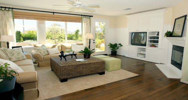
Among the oldest interior design rules is the 60-30-10 which splits up the color scheme into percentages of use. In essence, this means you’ll be using 60% of the main color, 30% of secondary and 10% of accent color. As a distance learning course in the creative process in interior design nicely explains, each stage has to be faced with creative strategies but one should also follow the advice of experts and the established rules. So, using color as a design tool while staying within the color schematics allows you freedom and versatility in their application.
Therefore, the main color should take up 60% of color used in the overall room design. This typically covers the color of walls, floor (area rugs or carpeting), and selected pieces of furniture. You may also include window treatments, such as draperies or curtains. You don’t have to stick to solid colors, but the main color should be the most dominant and prominent.
The secondary color covers 30% of the color scheme. This time, you’re only working with half the amount of color as the main color, but there’s no need for the secondary color to compete for attention in the total design. Instead, it should serve as a contrast to the main color and provide depth and interest in your design.
Your final choice is the accent color that is made up of one-third of the secondary color and one-sixth of the main color. Its purpose is to add more interest and contrast to the existing color scheme and it should be throughout the décor to lead the eye deeper into the design.
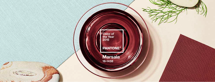
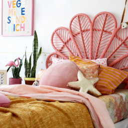
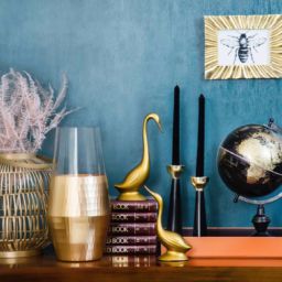
An instance of this rule can be 60% gray color, 30% light blue and 10% pink accent color.
Color Wheel
The color wheel is another great guide that can help you combine colors for interior design. This color circle contains the primary, secondary and tertiary colors and there are two ways you can use them when selecting a color scheme.
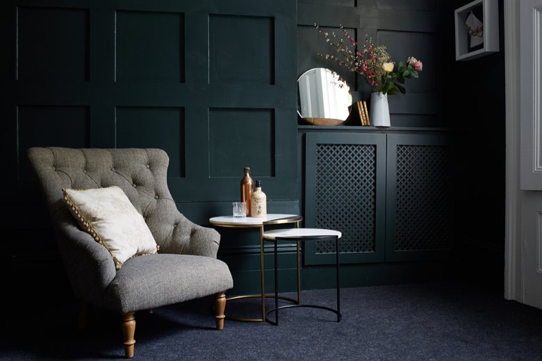
One way to go is to select analogous colors from the color wheel as your color scheme. They are grouped in threes, containing the primary, secondary and tertiary colors, but it can also be any three colors that are located next to each other on the color wheel. For a balanced selection, stick by the 60-30-10 rule.
For examples, you can go with green (60%), yellow-green (30%) and yellow (10%), purple (60%), red-purple (30%) and red (10%), or blue-green (60%), blue (30%) and blue-purple (10%).
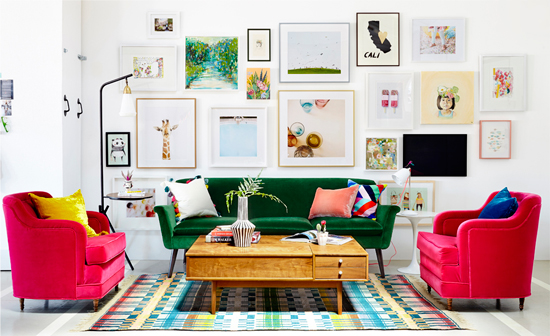
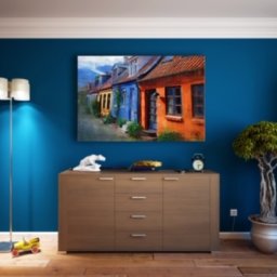
Another way to utilize the color wheel is by opting for complementary colors which means choosing the colors that are directly opposite of each other on the wheel. For instance, use yellow and purple, and add white or brown for an accent color. Combination two may be orange and blue with black or white as an accent color, or the third choice, red and green with gold or silver as accents.
Rule of Three
The rule of three is a similar way of choosing colors as with the three-color selections in the analogous color use of the color wheel, but the difference is that you don’t have to consult the color wheel to pick the three colors you want. This rule simply states to use odd numbers when choosing your colors and it doesn’t stop at three. However, three is the optimal number as anything more can turn to be too challenging and confusing.
When following the rule of three, you choose three colors for your color scheme and you can refer to the 60-30-10 rule, analogous colors, or complementary colors with an accent color. Once you’ve made your final choice for the main room, choose one color to carry it throughout your home. You can always incorporate other colors when moving from room to room, and this strategy will ensure your home décor flows and stays cohesive without being boring.
Color matching can seem difficult, but if you use the guidelines listed here, you can make it fun and relaxing. Color preference is highly personal and it sets the mood you want, so pick the ones that will make your home pleasant and enjoyable.